Author Archives: Stefan

of moon gardens and men


moon4-copy


Visualisation of the entrance courtyard (1)

should probably add some notes but its been a mad week and i’m tired. one thing springs to mind. following Christines notes about water fall, it could be important to work a drainage scheme into the design, in which case we’d need to find out what gradients (if any) are present. i suspect site conditions are going to place restrctions on our planting scheme, esp if we want to stick to the white theme, but thats something i’d like to work out once i’ve got the layout nailed. (besides, i suspect out of the three of us Tom is the most proficient plantsman!)

all comments/criticisms welcome, by the way!


landscape of ambiguity 2

moon2-copy2


so we have our site!

i’ve marked down a likely location for the wine bar area, and a couple of other things beside. the surrounding buildings cast a lot of shade.  of course we’ve know way of knowing what time of day/year the image was taken, but can count on the bottom (south) end of the site at least getting less light.

cant make out whats in the alcove created by the buildings at the bottom of the site, it could be a lower rooftop or something at ground level. it looks structural

the right hand side of the site (which i’ve marked down as the formal entrance) could presently be used for parking. an annoyance depending on whether or not we decide to acknowledge it.

also note how the building at the top of the site reflects a lot of light back into the site, creating patterns upon the ground. useful?

lurie garden

lurie


to go along with the discussion about planting design raging below, i thought i’d post this as an example of what can happen when a good designer and a good plantsman work together.

as part of Chicagos Millenium Park it references the indigenous landscape of the Midwest. the beds are contoured so the visitors walk along with the gardens at knee and waist height immersing them in colour. the native perennials (over 200 species) were carefully selected to create a dramatic sequence of colour and seasonal change. the effect is like a painting whose tone continually shifts throughout the year. if anything, i think it shows, if you want to create abstract effects 1. you cant be lazy about it and 2. you have to know your stuff

photograph copyright: Scott McDonald

drawings copyright: Gustafson Porter Ltd

lurie2lurie3lurie4

rural graffiti

and graffiti doesnt have to be urban


( i got these images from pic-tures blogspot, but cant seem to find it any more to add the link. i keep getting redirected to this taiwanese blog! anyway, i’ll put up more images if anyone wants to see them )

Branding the landscape

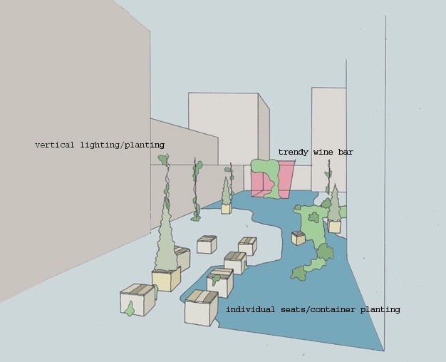
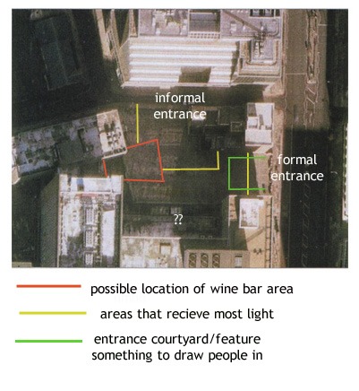
my first post for gardenvisit, so i thought i’d pose a question thats been on my mind for a while. also it ties in neatly with Toms post below.


Is there too much public art in the landscape? reports say that there has been a massive boom in public art commisions in the UK over recent years, and I’ve applied for a few of them myself! so I’m playing devils advocate here, or being a hypocrite, whatever way you want to look at it.

all the same, it seems you can’t go anywhere now without there being some sanctioned artwork there to explain the place to you – telling you what you should be thinking and explaining how you should be feeling. isnt there room any more for ambiguity, or an individual respone. can’t a place just be a place?

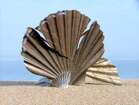
the adlesburgh scallop (pictured) makes a good case study. a source of recent controversy, its detractors say there is nothing wrong with the artwork itself, but its location was beautiful..more beautiful without it. it is an unnecessary detraction.

the artist says that they dont understand the work – that it was created especially for that location. the insinuation is that as an artist, her response is more valid than everyone elses. more valid than the place itself which should serve as a setting for her work.

the council say it works because it has attracted more visitors to the site. nature on its own is boring, and hard to sell. who wants to be left with only their surroundings and their own thoughts? best to give them the ‘proper interpretation’ so they can get their thoughts in order. and this i think now is the real role of public art – an exercise in branding and marketing, a logo for the landscape